How to make a Wet & Needle felted Landscape Painting with Wool
Using paint to make landscapes has been a passion of mine. How much fun it was to treat this project in much same way. Working with Wool is much like painting…
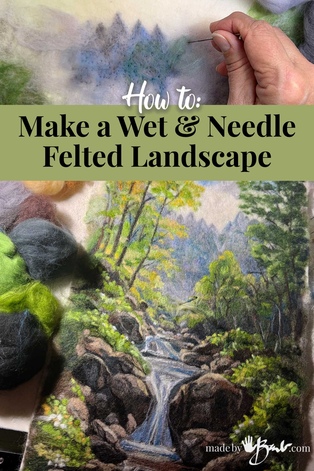
As you know, nature brings me much joy so I get quite excited to translate that beauty into another form. This made with wool fibres.
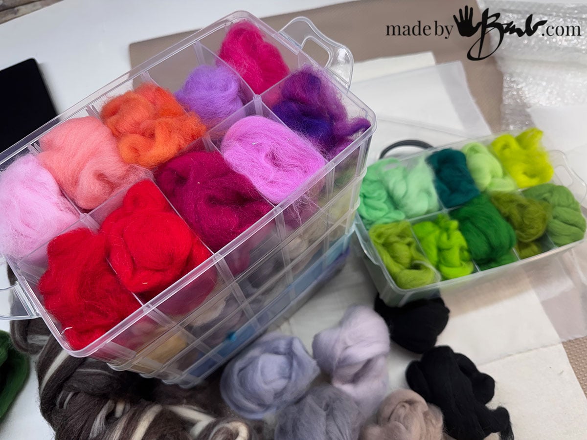
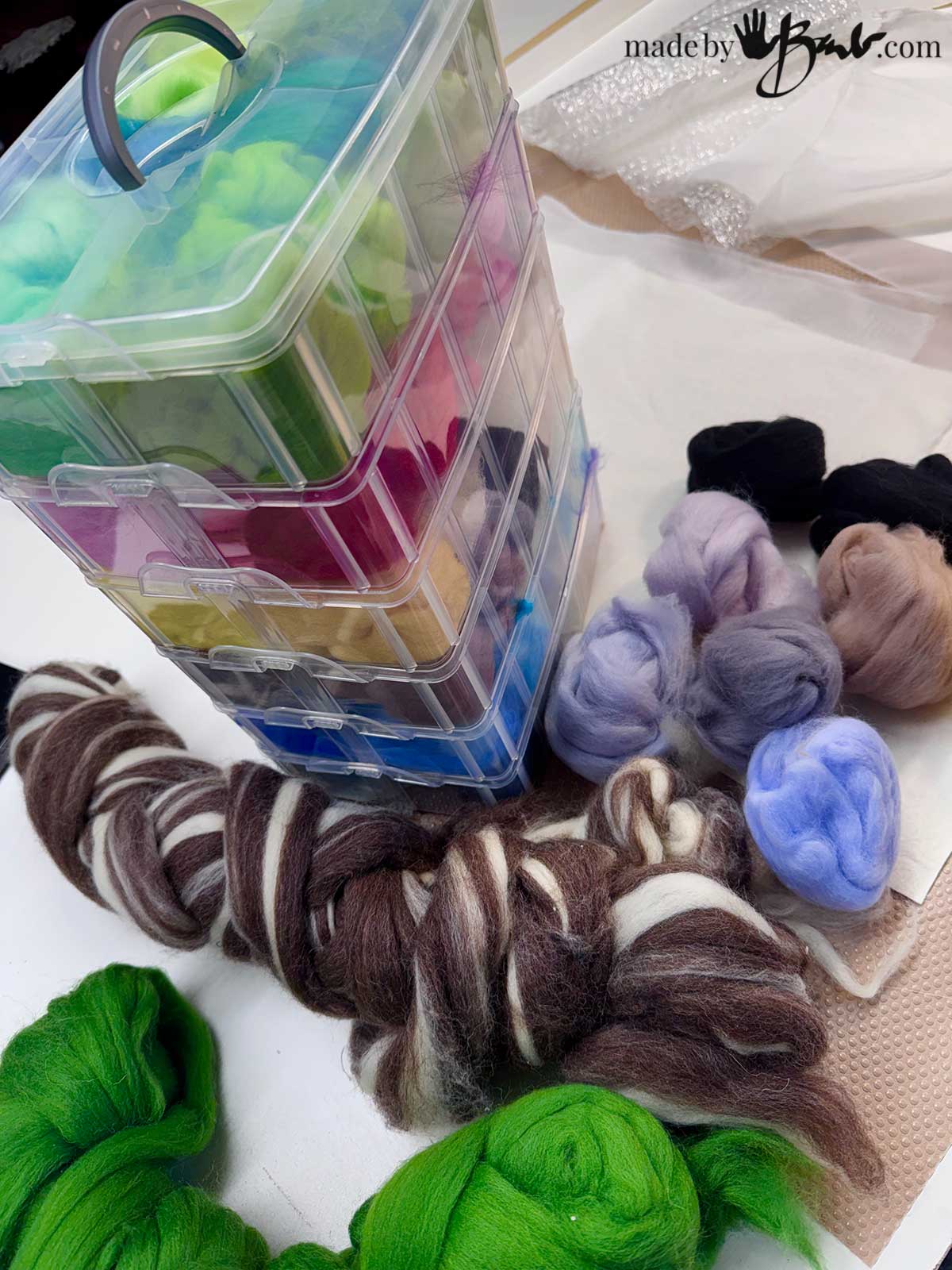
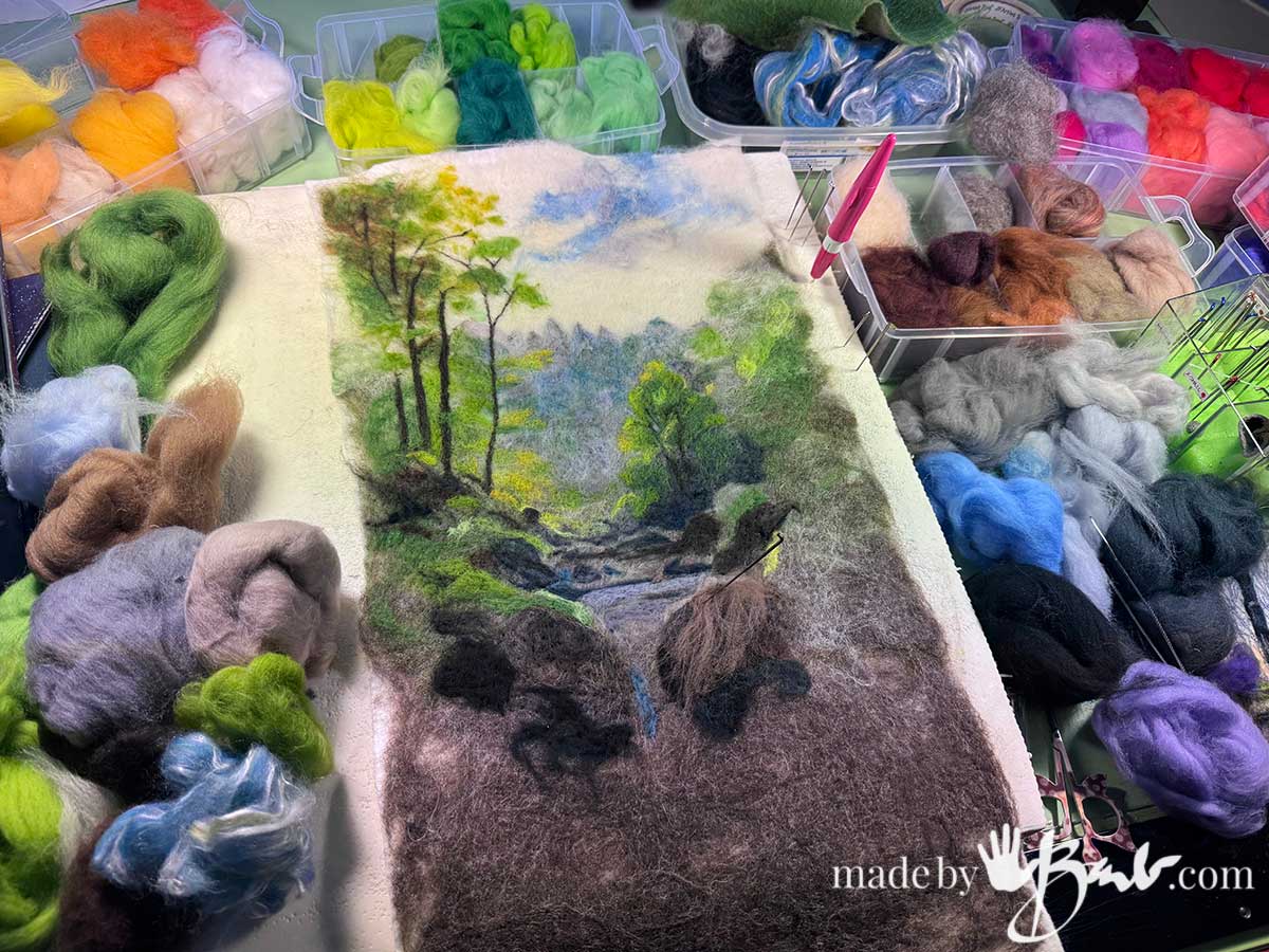
Wool Fibre Colour Palette:
As when working with any media colour is a major concern. Do I have all the colours I need? Can I mix the fibres? I do love the portability of these boxes that snap together and stack to carry as one.
Yes, you can mix the fibres! Also having some neutrals will help adjust the ones with strong pure hues. It’s the same way I would think of paint choices.
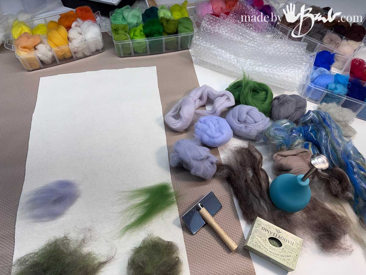
What is wet Felting:
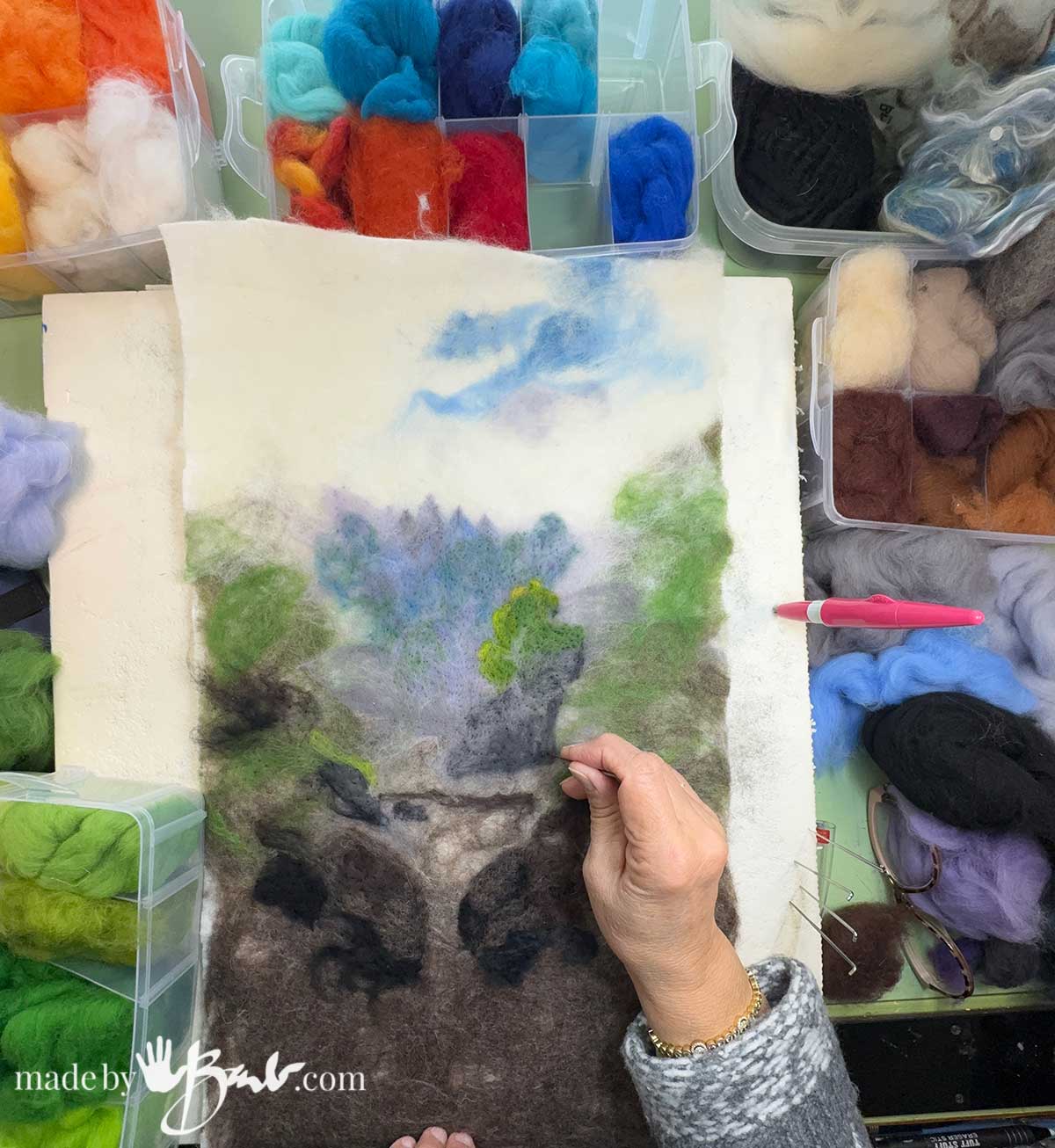
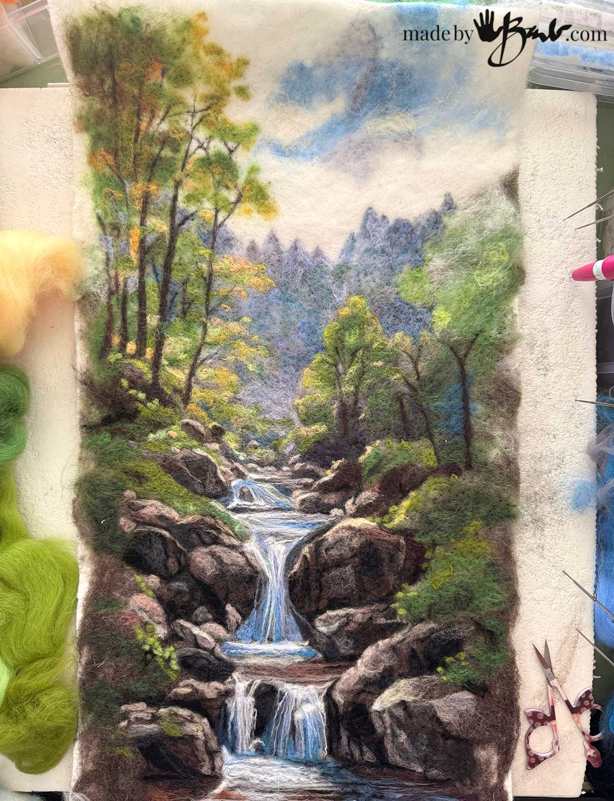
To make this ‘painting’ come together a bit faster I decided to make the back ground with wet felting. The fibres are laid on a backing (like wool felt or fabric) and then agitated to create a new piece of felted fabric that can now be needle felted on. That saves some poking time and is much like an underpainting.
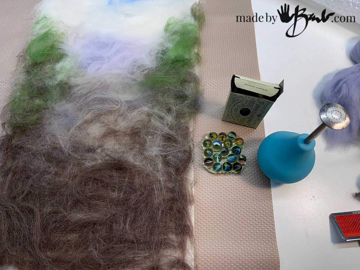
The wet felted background does not really need to be the exact finished colours. Consider it more like blocking the base colours. (see the video part 1)
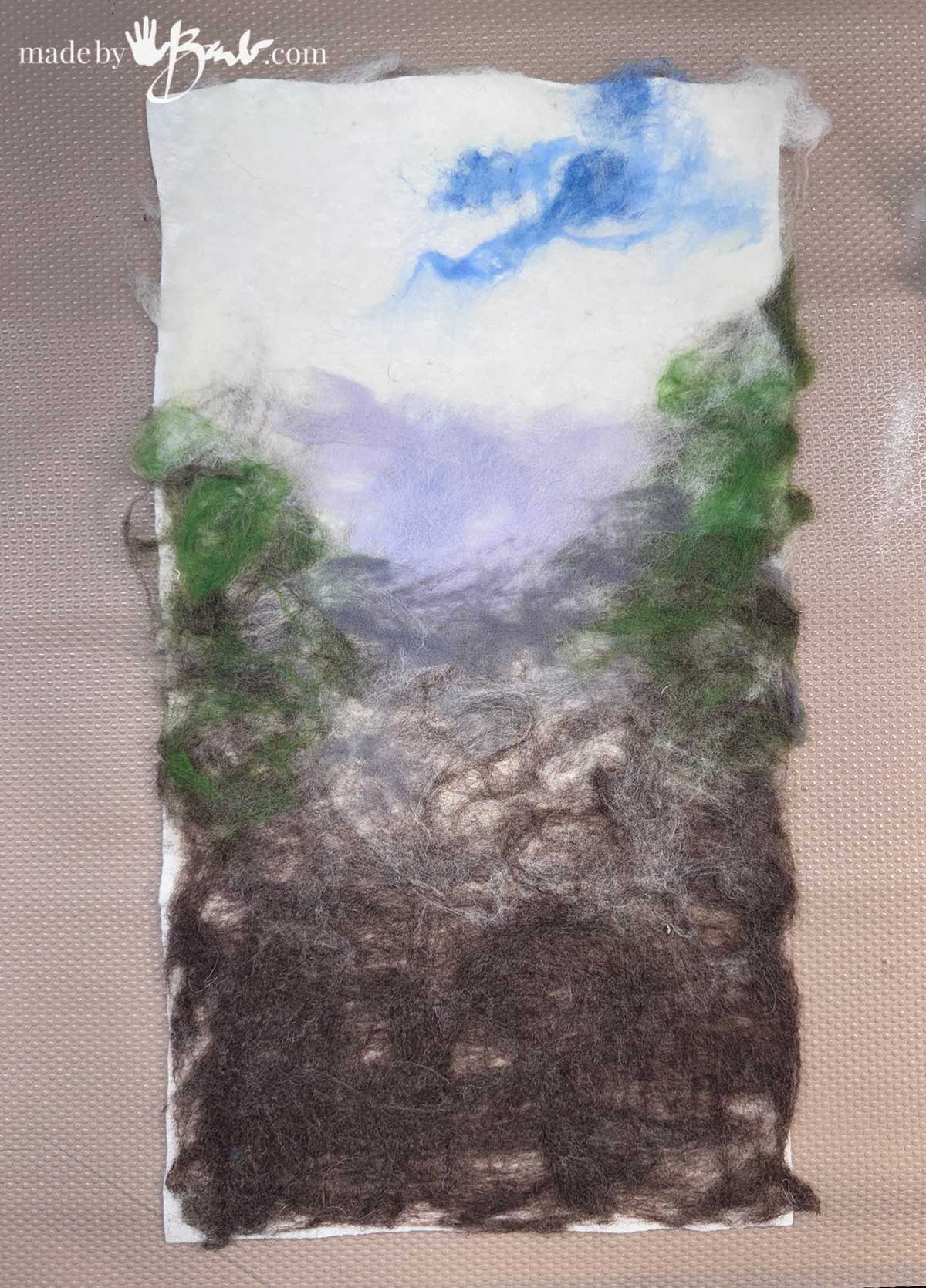
After the agitation, rubbing and rolling the background is rinsed and dried. Iron it flat and stretch into shape. Since there will be more needle felting I have not worked the wet felting very much.
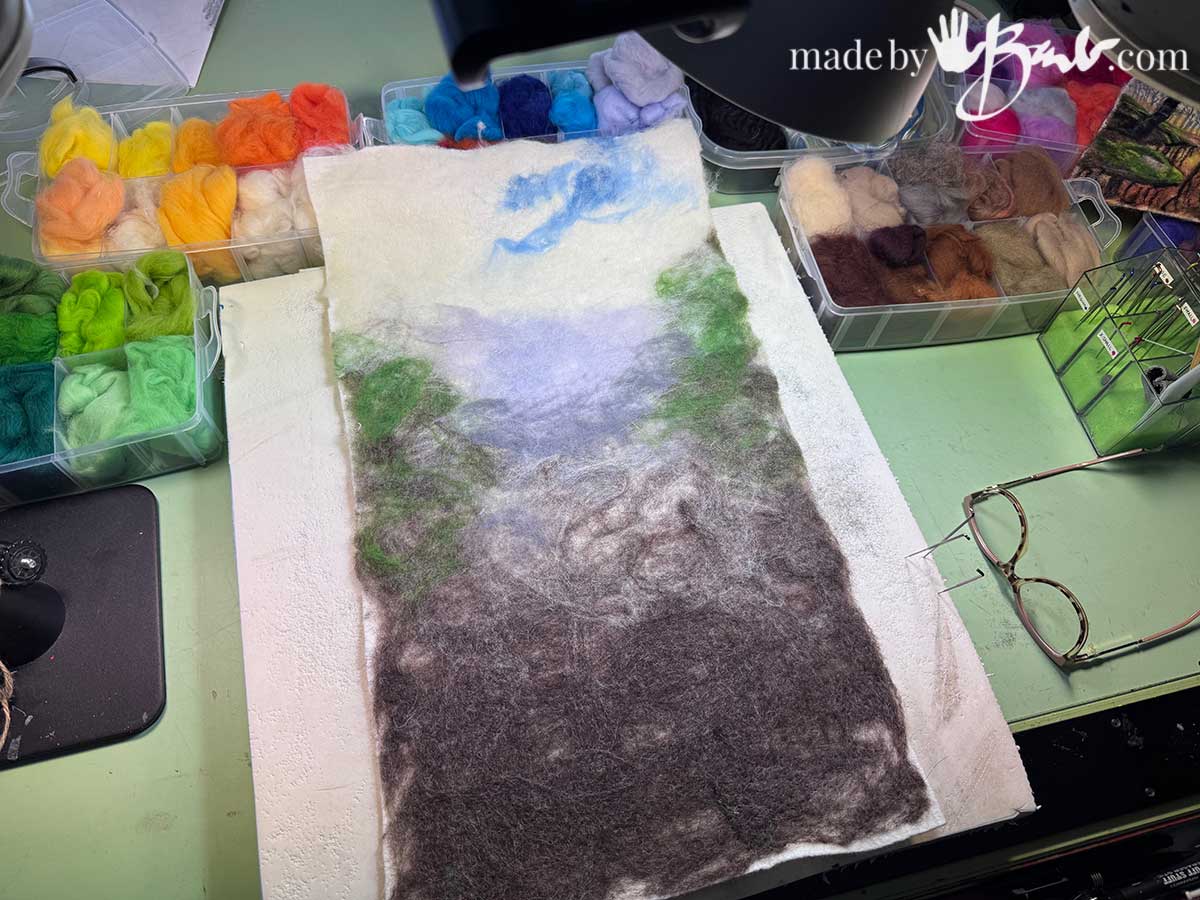
Adding the Needle Felting:
One of my experiments here is to mix most of colours that I am aiming for. I can imagine that sometimes we just don’t have every colour of wool so we need to use what we have.
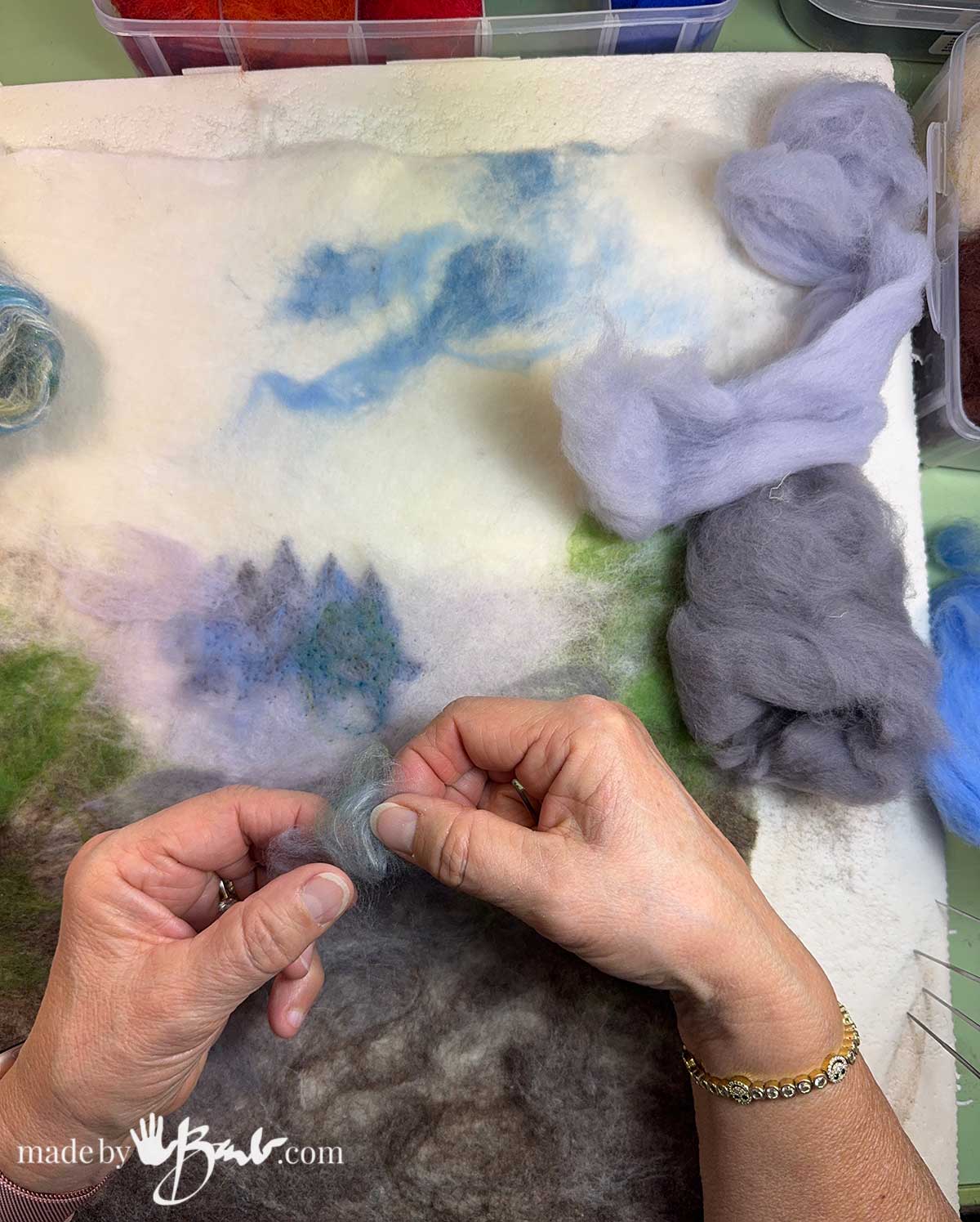
Colour mixing Roving:
Take small amounts of colours keeping in mind colour theory. Add dark neutrals to tone a bright colour or a bit of a light white//yellow to brighten a green etc. If it still is not to your liking, add a waft of a bit over top.
I must admit; I am really loving the way the colours can be applied. But then again, it is much the same as with acrylic or watercolour paint; so many techniques can be used. Transparent or opaque, linear, texture, it can all be achieved.
The fact there is no paint drying, and I that can pull wool off again makes it so forgiving. Since I tend to be quiet fussy in my painting style, I can do the same with wool. There’s no rule that heavy applications are needed, you can use tiny additions.
When using an opaque media it is often common practice to layer dark to light, to add the highlights last.
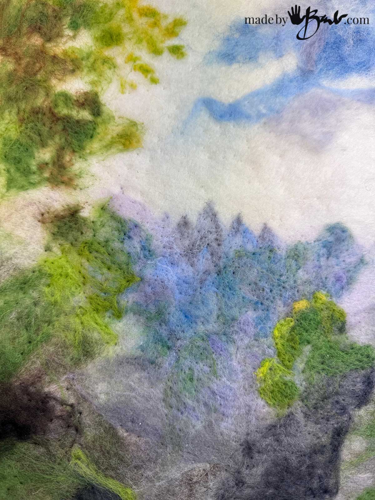
Bits of colour will blend from a distance but create interest when viewed close. Think of all the swirling colours in Van Gogh’s art!
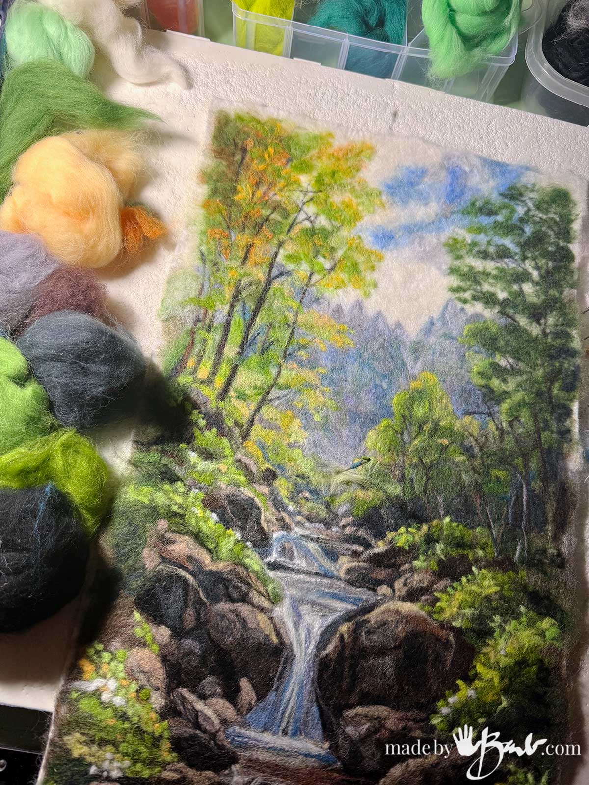
Poking in the details:
Try to avoid using pure black. It will take the ‘life’ out of colours. Use a brown or a mix with blue or purple to add shadow to colours.
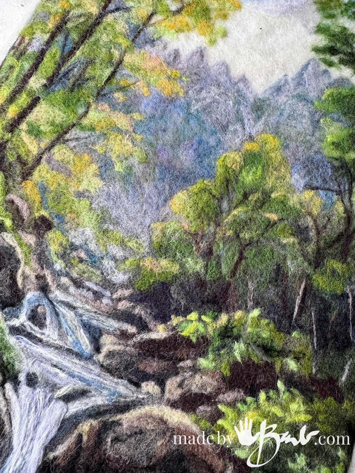
Distant tree lines are often less saturated colours. Ask yourself what the contrasts are between the foreground and background. The brain often likes to assume what it already has seen and may miss what is actually current.
My Helpful trick:
To make sure not to fall into preconceived mistakes, pretend that you have never seen anything like your reference material before, as if yiu do not know what it is. This will make you aware of what you ‘actually’ see.
Since adding small little wafts of colours is much like adding a watercolour wash to adjust a colour. The individual fibres blend to show underneath.
It is much less stressful to ‘build’ a painting than to expect perfection in one layer.
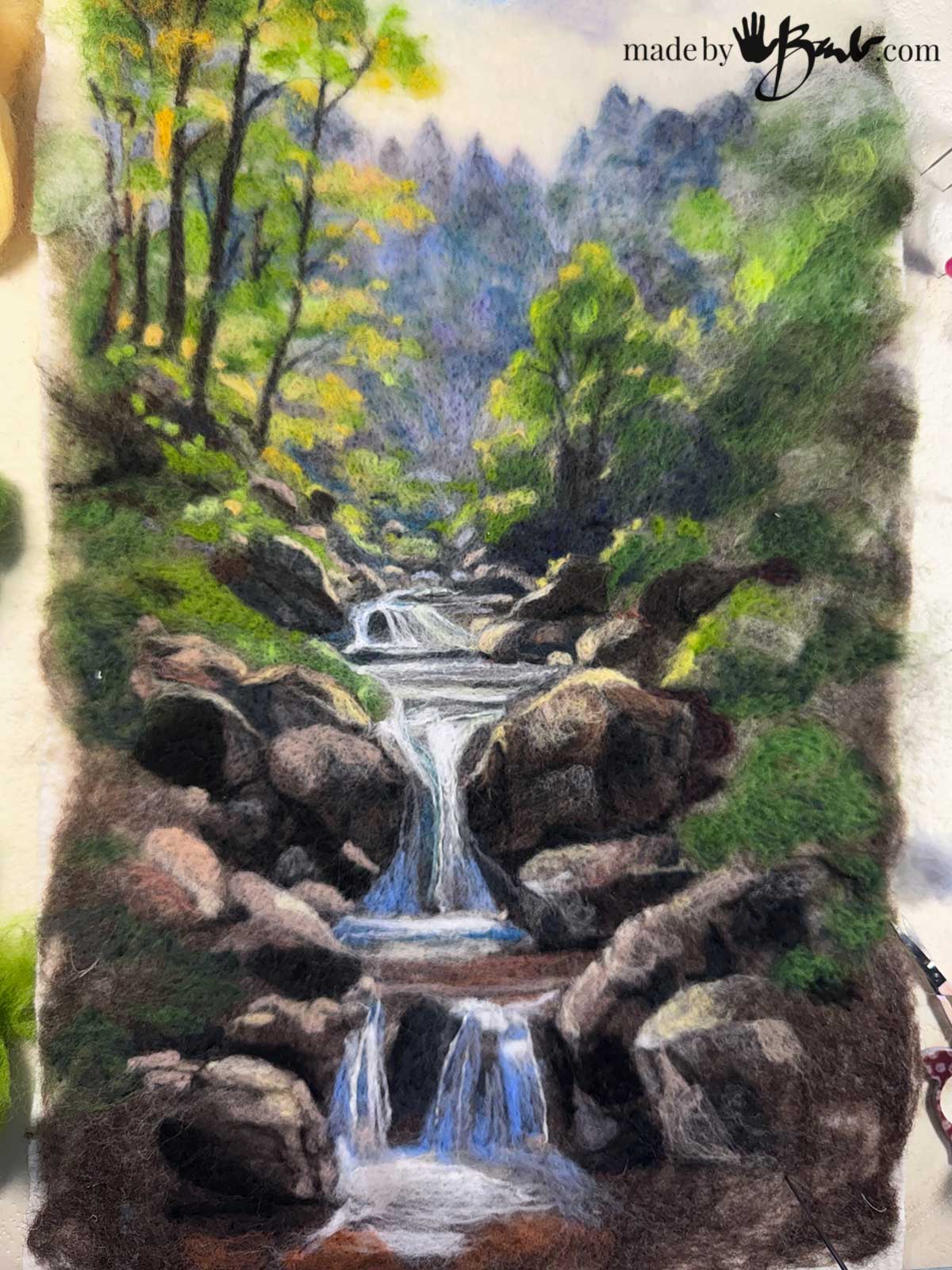
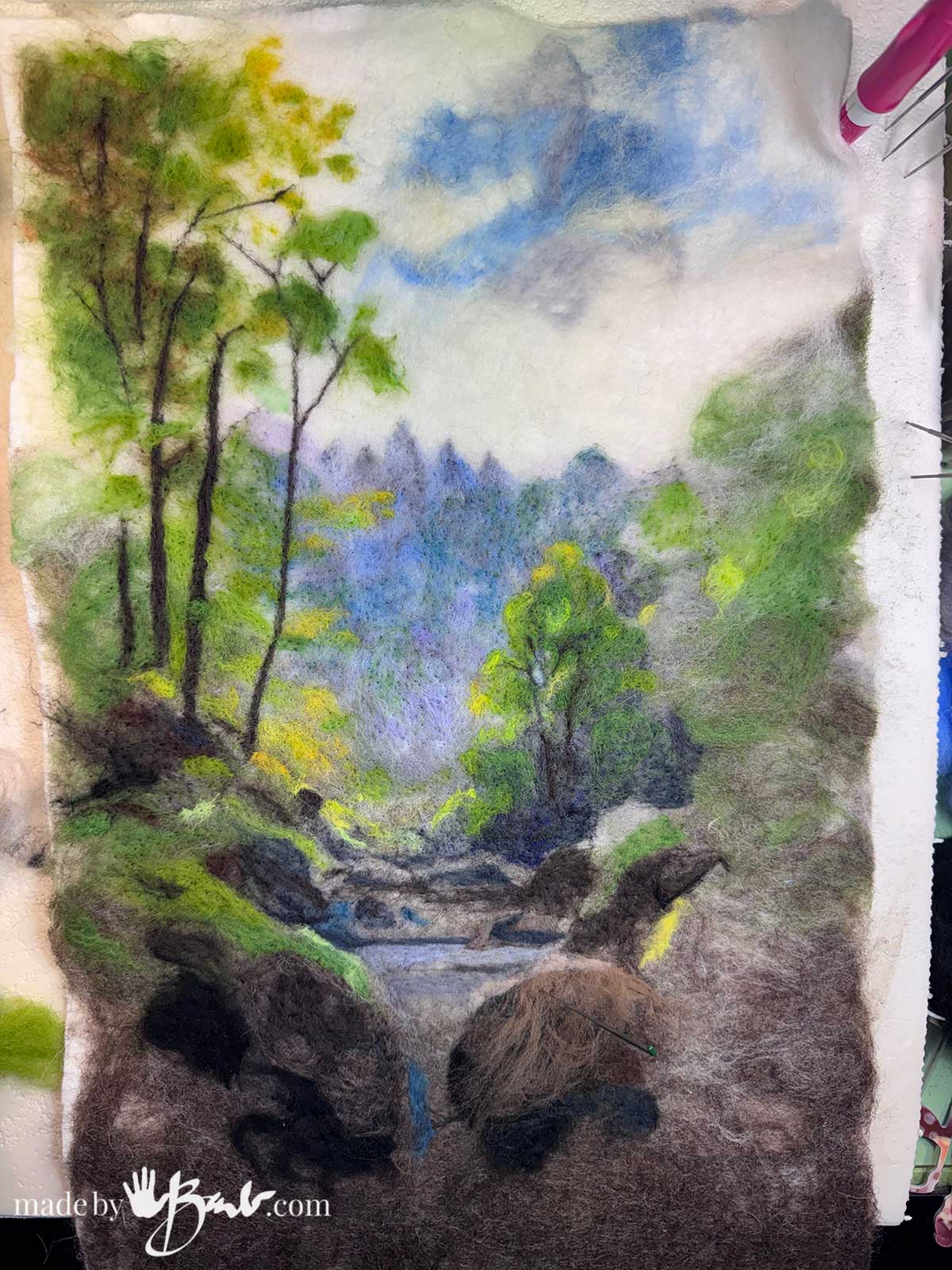
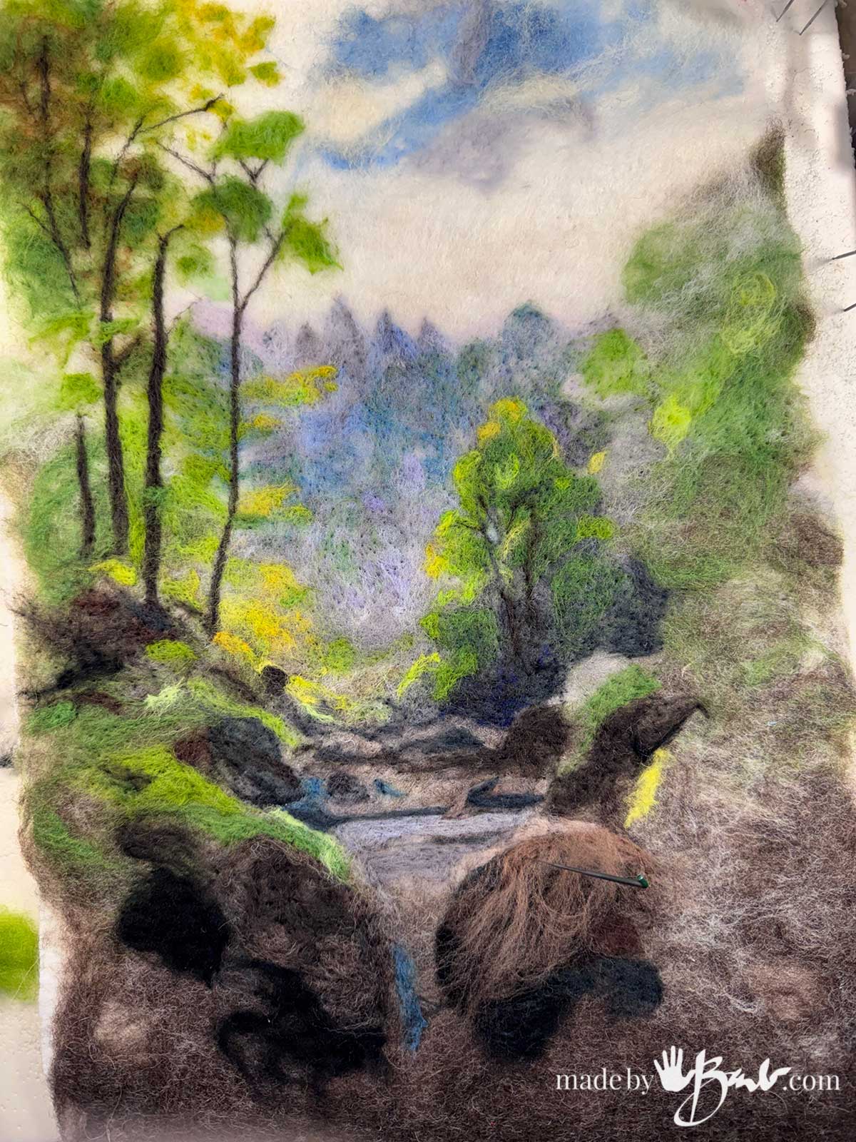
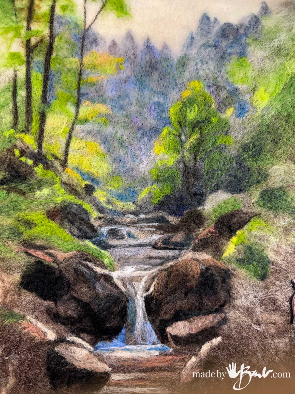
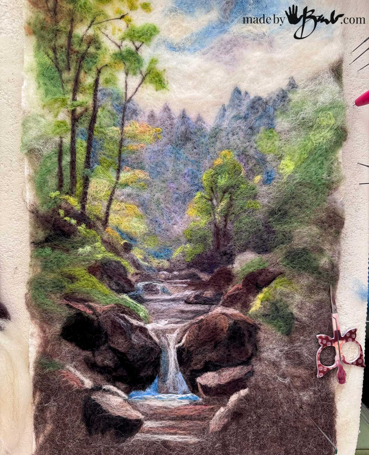
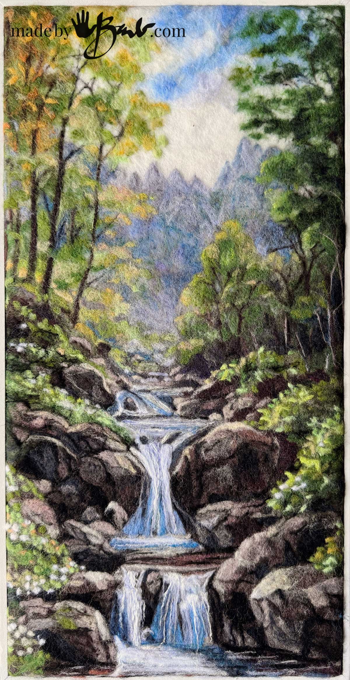
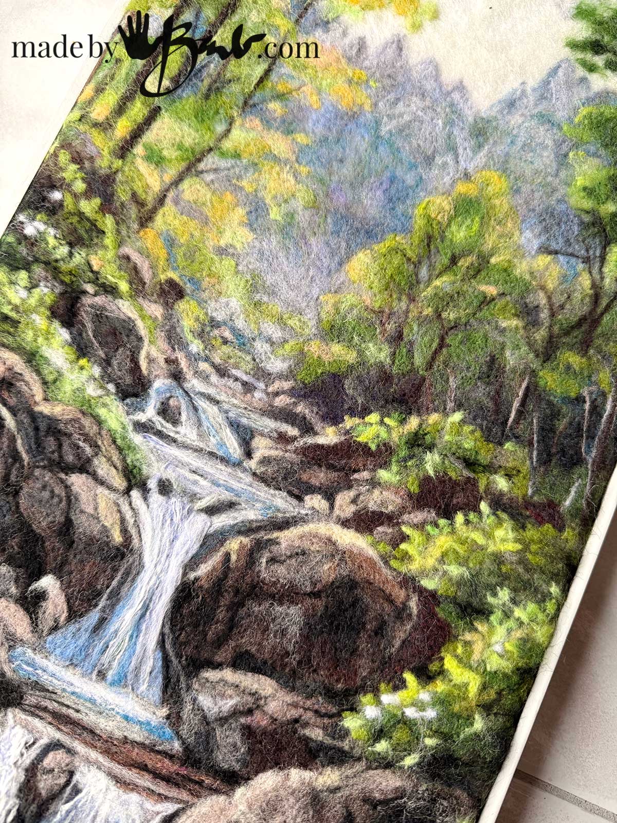
How to make water falls:
Rendering water in other media can be challenging. Since the fibre are already very much like strands it works quite well to represent water. Some other fibres like rayon and silk can add a nice shine to the bright whites in water.
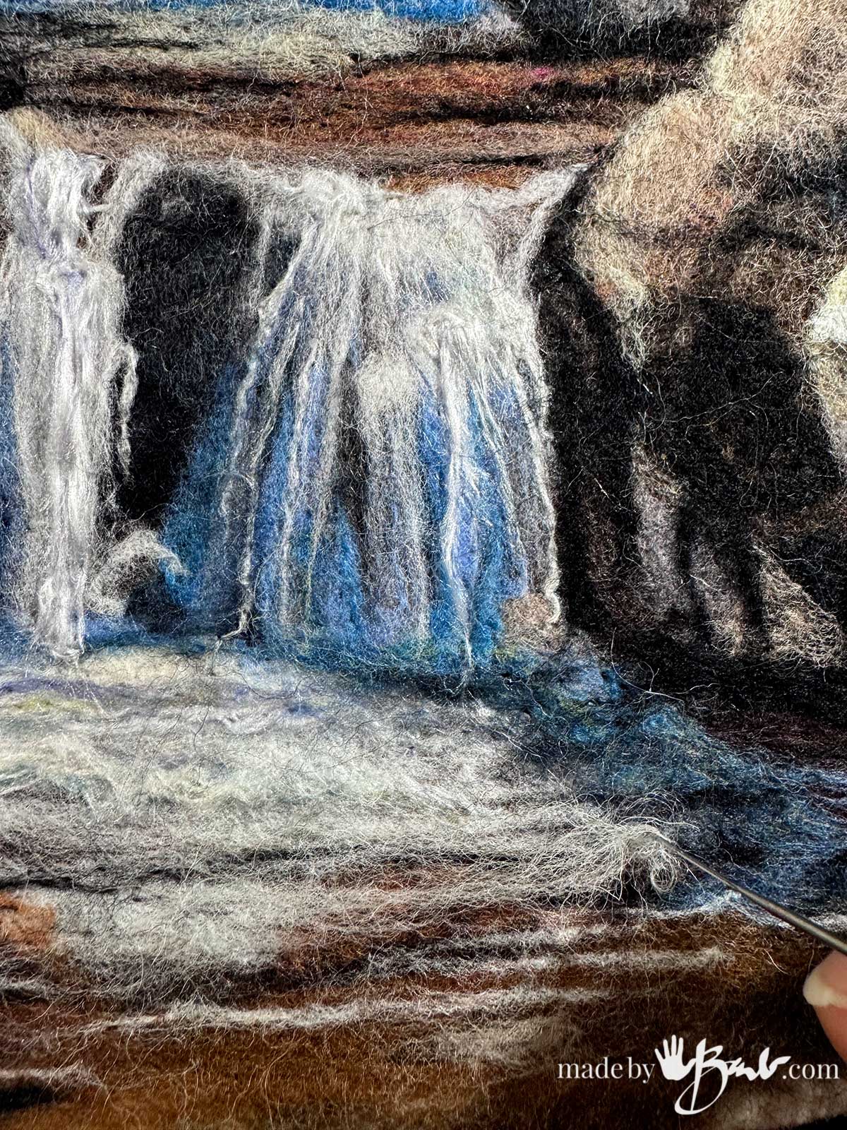
Twisting some of the fibres will give you more linear details. The fact that it is also a bit dimensional is perfect for flowing texture too.
Yes, I know, I really like to render rocks! The different planes of rocks vary in value to define the form. The dark cracks are so simple to add with minimal fibres.
Keep squinting at the art to see the true representation of value. The small leaves are achieved with a bit of spinning/circuling of the fibre before poking down, almost like a french knot.
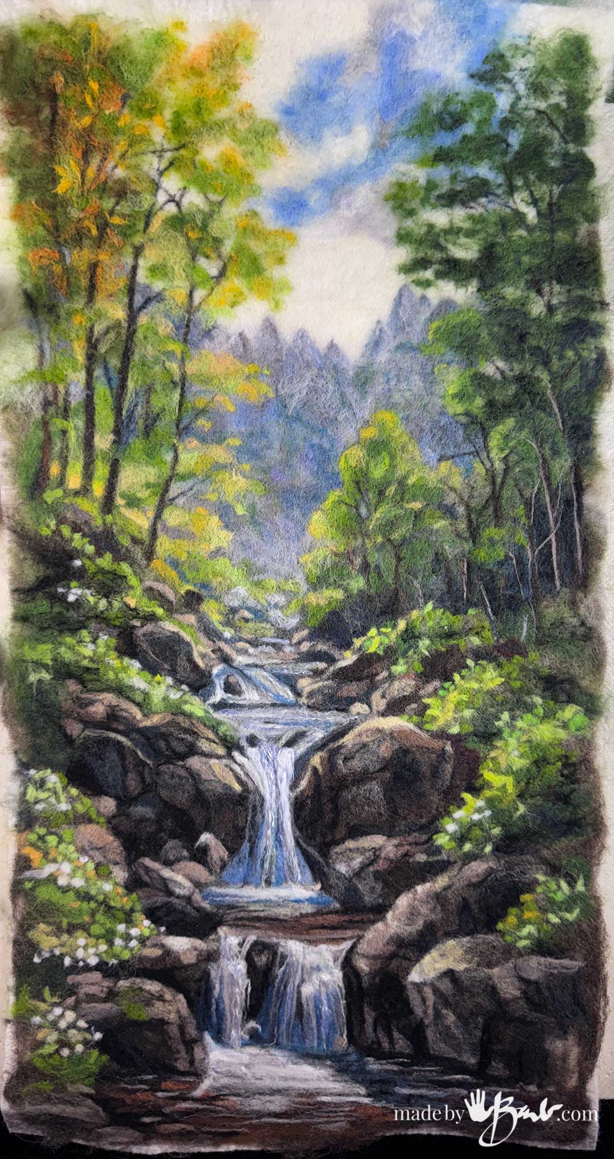
What do you think?! Notice that strength of value from foreground to background. The reference photo was only for loose ideas as rocks and trees and water do not need to be exactly as the picture.
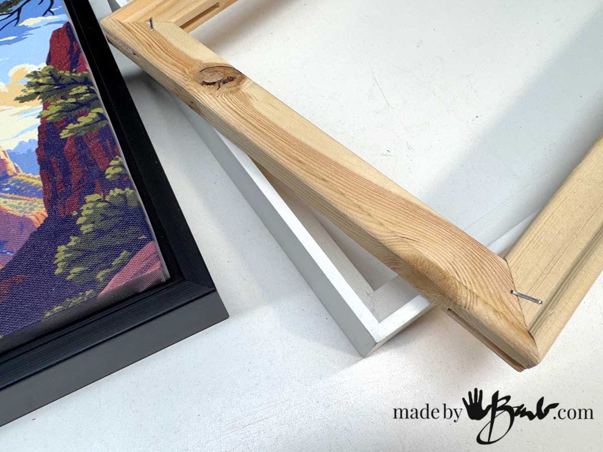
Framing the Final Art:
Give the full art a good steaming and shaping. If some of the poke holes show a slight rub will help them ‘heal’. I like to use floating frames since they are minimal but the art is stapled over the stretcher bars before inserting.
There is no glass that goes over the art.
Going back to actual messy paint but a long time away… I’m really loving this ‘slow art’ that is clean and portable.
Many of these shades and tints were mixed colours. I am now more confident that mixing will add interest and more diversity of colours.
Have I given you the inspiration to give it a shot? It seems every time I see a beautiful sky with sun and clouds I feel like I’m looking at wool fibres…
I love this Barb. I love the idea of a wet felted background. I’m ready to go. Have a background ready. What do you use for a mat underneath your dry felting? I’ve used an old foam cushion but wonder if there is something better?
I use a few things depending on the size. I have a large sheet of some dense closed cell foam that works great. I’ve also made a pad from some layers of old wool blanket as seen in this post The inexpensive kneeling pads can work as well. In a pinch foam will work. Look around and see if you’ve already got something… Happy felting!
You are amazing!!!
Thanks! I’m glad you enjoy my journey! ‘So much joy comes from creating!
Looking forward to trying this tutorial! I am also wanting to know where you purchased the snap together clear box…whould be greeat to take to my felting group….and I bet I’m not the only one! Many thanks for all the sharing you do on this site, we who are new to the craft appreciate it!
I found those at our dollar store in Canada – Dollarama! Yes, great to travel! Enjoy!