Concrete Bas-Relief Botanical – Colour or Not?

Oh decisions decisions, even when it comes to finishing our concrete! Let’s take a close look at the ‘what & why’ for our beautiful Concrete Bas-relief – colour or not.

The reasoning:
As an illustrator and artist there are many questions that I ask myself when making a piece of work. There are certain accomplishments that I want each piece of art to make, even though they are not always the same. You are in control, no one rules what you decide – really.
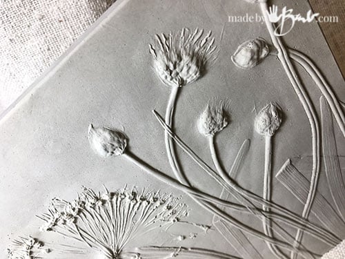
These relief castings whether Plaster or Concrete have so much texture and form taken from nature. When they are cast and have no colour they are essentially monochromatic (using only one colour) with the use of grey. The light bounces off the forms to create the ‘picture’. Technical, yes, but that analysis helps make a decision.
Each plant specie has different qualities; some have much relief and catch the light so much more whereas others that have hardly any relief are quite flat. Let some of analysis help you make your decision. I tend to choose plants that have some strong enough structure to hold the form through the imprinting process.
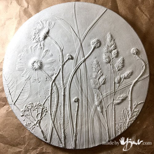
Notice the Daisy here is quite flat, but luckily the other leaves and grasses do give good shadows.

Subtle Accenting:
One choice of providing an accent without major use of colour is just with dry-brushing. If you have read my post about painting the Cast concrete Leaf bowls you know I like to use this technique a lot. Reason; you do not need any fancy painting skills and it is subtle. It just adds a bit of difference of colour (light or dark) to the higher surfaces than the lower surfaces (valleys). The trick is to have hardly any paint (in this case a good quality acrylic paint) on the brush. I use a paper towel to make sure I rub most off.

When you look at this you probably do not notice the painting at all. That is because it is basically acting like the light; just bouncing off the higher parts. Personally it is one of the best techniques for relief anything! That is why those popular beer steins are painted this way – and it super fast!
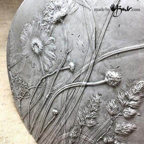
Check out the lovely detail! Each part of the gras shows like a line. We often want our art to be detailed and defined, and this does the job! Why make more work when not needed?!

It’s all about Contrast:
When there is more contrast things stand out. If the background colour is darker or stronger then the dry-brushing highlights give much contrast. It’s like wearing a very strong lipstick colour – it will stand out from your face! A white will stand out more if the background is very dark. You can add colour to your concrete mix to make it easier to have a dark background.

The Challenge of Colour:
This relief casting has much area that is not that ‘relief’ so I wanted to try colour.
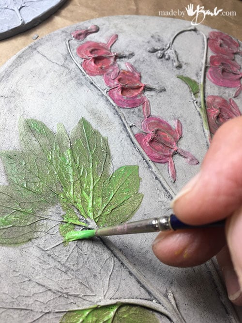
Bleeding Hearts are one of my favourite spring perennials! They are quite strong greens and pinks. For some definition I first gave the piece a thin wash of dark watery paint to catch in the crevices and make them darker; that works similarly to the highlighting dry-brushing.
Then some transparent layers of colour were added to the leaves and flowers. I feel kind of juvenile when I paint like this as it reminds me of a colouring book! It is not my favourite.
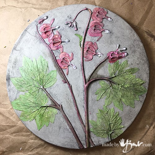
Do you like it? I am sort of ‘Bleh’ about it. To me ‘IF’ I could paint it as I like it would end up being all about the painting and no longer anything about the relief at all!
Take Inspiration:
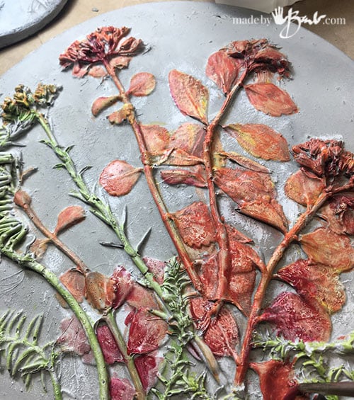
Well, sometimes it might feel so right to add colour. These are some of my garden succulents that are various shades of reds. They are quite dimensional and do have good relief as well as large details.

No flat colour application here; I wanted many shades of red.

Scary when you apply the antiquing over the colour! ‘But this makes the piece even more dimensional since it catches in the crevices. Just make sure to wipe quickly…

Alright, I like this one, what do you think? I think it party works due to the amount of colour variation and also the texture.

Let me know which you prefer…

Light makes the difference:
You know that light makes ALL the difference! If the light is skimming across the surface the details are more obvious; like thse dark circles under your eyes! The same goes for these wonderful pieces, so it is best to have them on a vertical surface since most often the light is coming from above. These have no paint that can fail if you hang them in the elements, as acrylic will hold for a good length of time but probably not forever.
Check out much the subtle details are caught with the light here; the Hosta blooms even show the stamens.

Personally I think I love the simplicity of no colour. I know it’s hard to say considering that I have colour everywhere – but maybe that is why. I sometimes just need the chance to ‘take a break’ from colour to relax a bit. These days all the white walls gives us that relaxation; but feel free t do as you like! Be unique and original.
I hope I’ve inspired you in one direction or another. If you like one of mine; I can help with that as well There are both ‘naked’ and painted ones available…
How could anyone choose? They are both beautiful in their own right. I had thought I would like the plain ones better but I didn’t know then how perfect the coloured ones would look. You are amazing, Barb!!!
Unpainted is my favourite, but then again I love your antiqued succulent one. Hard decisions. ❤️
Barb,
I LOVE the diversity in your work. Its just exciting to see what you have designed next! I really like the “no Paint” version, but how about painting only 1/2 and leaving the other in plain concrete – the best of both worlds? It adds another element of texture in and of itself.
Best regards, Judith
Hmmm, that makes me think of the ones where only one small flower has colour! Another option… The more all the mediums collide the more interesting it gets! ‘Still a lot up my long long sleeve!
Unpainted is much more sophisticated looking
Yes, that’s a good word for it!!!
The colored version looks like Art Nouveau where people liked to have lots of natural colors in their decoration, but nowadays people like to have a calmer atmosphere. Monochrome looks more modern.
This reminds me that most buildings, statues and bas reliefs from Antiquity were brightly colored! Yet we still prefer the monochrome.
Excellent article: the sort you store for reference or pass on to a friend. I love how well you cover options, doing much of the trial and error for us. Thank you!!
The one of the Bleeding Hearts: try a monochrome accent over the top. (Maybe a matte varnish over the colour so it doesn’t get removed in the process.) I think that will restore the 3-D of it.
I think it depends on where I’m putting it, and it’s purpose. As stepping stones, in the garden, I’d prefer no color, so that while they have their own beauty, it’s subtle and doesn’t distract from/ clash with the colors of the garden, itself. As an outdoor entry accent piece, I think most folks would find color warmer, and more inviting. Indoors, it would depend, again, on the rest of the decor. Color would be a lovely way to bring a pop of color to a relatively monochromatic color scheme, while no color – or the simply elegant dry brushing – can bring a certain calming effect, in a room with an otherwise busy decor theme.
They are so pretty! Although both ways have merit, perhaps just a hint (a light tint) of color might work, too.
This should give you a laugh. I decided to try the stepping stones. Off to the big box to get my supplies. Found everything OK, but after I pulled a 60lb bag of cement into the cart, I realized I wouldn’t be able to lift it out! So, an employee put in the trunk for me. Great, until I got home. Now I had to get it out of the trunk…I slid it into a reusable store bag, put a shelf board like a ramp, then slid it out and into the wheelbarrow. At 71, I often must improvise, but it’s a challenge and when something works, it feels so good! Then I realized I had no sand, so now there is 50lb bag of sand in the trunk! Please wish me luck in making the stepping stones.
I really love your work and appreciate your clear and concise instructions,
Thank you!
Judy
They both look great. I think it depends on where you want to display the plaques.
Love what you do.
Yes, you are right. Thanks for chiming in.
I love all of your techniques. It’s really impossible to choose one over the other.
Thanks so much!
Hi Barb , the girls and I have been trying this project, we made the plaster step and they turned out wonderful, now I want to give it color; but do I put mogpog on it before I add color.? I put watery paint ion the back without any coating and use soaked in before I could ever wipe it off. I think I missed a step. What did I miss.?
Thanks Donna
Since the plaster is so very absorbent it will be hard to wipe off, but don’t despair! You can now lighten again by doing some dry-brushing techniques. Only have a tiny amount on a soft brush and brush quickly over the details and only the top parts will lighten and enhance detail. Use less rather than more and build up until happy. It can be white or light colours. The more opaque the paint – the better! I love dry brushing!!!