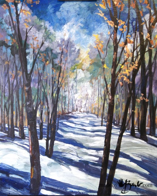
Step by Step Forest Scene Painting
I know what you are thinking… Most people believe that they have no talent, but I want to prove them wrong. With so many of my walks through the forest, the landscapes have been etched into my ‘visual brain’. My blue guest room needed some art and the wintery shadows just flowed from my mind. Yes, I hear you, it may not flow from your mind but that’s why I am here; to show you step by step painting…
No need to enrol in a course or go to the ‘painting cafe’! Actually, I do spend a lot of my week giving instruction to empower the ‘inner talents’ to come out. My analogy is that this type of painting is quite easy since there are no specific rules. It can be interpreted as you like.

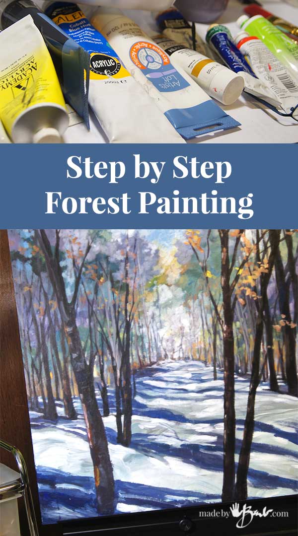
Supplies:
- Any canvas or board can be a starting point. If you are hoping to save money, why not just paint white primer over an existing canvas/art that already has a frame?!
- Acrylic Paint (Primary colours: cobalt blue, yellow, red and white, black, and other tones if desired)
- one small brush
- large flat brush 3/4″ wide
- water container
- palette (old styrofoam meat tray works great)
To make this quite ‘Artsy’ I am using acrylic tube paint that is very thick and undiluted. I am purposely not cleaning the brush and mixing some colours right on the board.
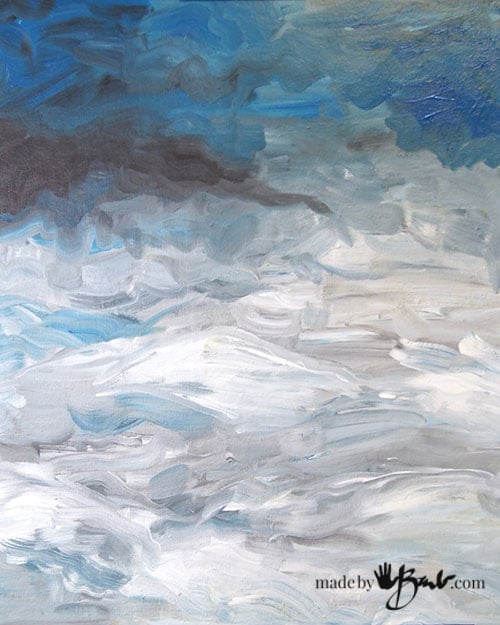
Step #1:
Using cobalt blue, some purple (mix of red and blue) and white, create a sky that gets lighter as you travel downwards. Mix in small dabs of black, purple to create some variations in the strength of hue. The top should be more blue at the top, then more grey to show distant trees. The bottom 2/3’s will become the snow covered ground so some variations in the white will look natural.

Step #2:
Using some yellow and orange add a suggestion of sun. Blending in some soft tones of white into the distant tree lines will give the illusion of atmospheric depth and distance.

Step#3:
Continue imagining some distant trees and make them very light muted tones by adding purple and white. To weaken the blue add a tiny bit of orange (the complimentary colour of blue) will tone it down. Squinting at the painting will give you a sense of how it looks without the details. The distant part should be much lighter and less vibrant colours.

Step #4:
Continue making some mounds of shapes to represent distant trees. ‘Smush’ them together as they should be soft edged and somewhat blurry. Work from the background distance toward the front.
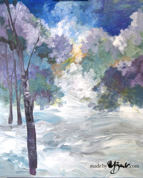
Step #5:
Mix some black, blue and red to make muted purples for distant trees. Thinner distant trees and thicker/darker closer trees.

Trees don’t always stand straight and don’t worry about every branch either. Be ‘impressionistic’…
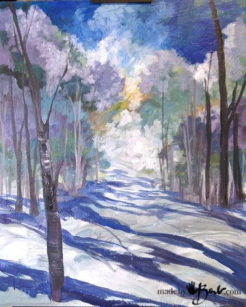
Step #6:
Now that there is a forest you need some shadows. Choose a direction and streak the shadows across. They should be a version of blue with some purple tendencies.

Squint at the painting or stand back and see how the depth conveys.


I’ll admit; I usually paint quite meticulously but I was tiring of that amount of detail so this method was quite refreshing. Sometimes it’s just great to take the pressure off! Most of the mixing happened right on the painting.
Step #6:
Just a few finishing touches and it’s done. Dab on a few leaves and some warm colours in between the trees. It helps to balance the amount of cool colours.
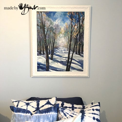
We have just finally gotten rid of the snow outside so this will remind us of our great winters here in Canada! The frame is up-cycled by being painted white from my collection since everyone likes to give artists frames…
Fresh and cool, roughly painted… And won’t you be proud when asked where it came from?!
Barb
I know you say it is easy,, but I cant help but be impressed. You are so talented.
Awe thanks, but I think most of my accomplishments are due to the fact that I am really really stubborn and will persist until I get it right! That makes a big difference as many want a reason not to be able to do something…
Barb this is just beautiful and your explanation of the process is too. Thank you for your generosity of spirit. When I can find the time I will try to see if I can manage anything like your examples.
I do hope so! I usually paint with much reference but this time I took the pressure off, and it was more fun!
Thank you so much for this. I might actually give it a try with your excellent instructions.
All the best
Susan
I can’t tell from the photos if you paint completely flat, or if you leave raised areas, with a textural surface. What is the best way for something like This? Beautiful, really lovely, by the way.
It has a bit of texture but is not really thick at all. Just make sure that you cover the base colour. It could be painted in a thicker style but then the wait for drying to continue would be longer as it’s hard to paint the foreground on thick wet paint. Have fun with some paint… 🙂
Barb,
I love your crafty site! You are making so much possible for us beginners to get started. Keep up the good work!
Haha, I’d call it more of a DIY site… Enjoy! Make it your own…
Wonderful! Thanks!!!
Enjoy! I am just about to do a big painting, I’m excited.
Love this!! You make it look so effortless!
Once you start and let yourself explore it gets easier & easier… Enjoy!